Google’s New Logo Is a Sign of Where the Company Is Headed
Google is shaking things up again, rolling out a new logo that indicates where the company is going even as it keeps the colored letters that have become so familiar. The company’s most significant redesign since 1999 does away with the old font and its serifs (those little lines at the end of each character) and replaces them with the same custom typeface used in the logo for Google’s new parent company, Alphabet.
The new look does more than just make the logo sleeker and more modern while echoing the newly created holding company. It also speaks to where Google is going — namely, its increasing presence on our mobile devices. Google’s Vice President of Product Management Tamar Yehoshua and Director of User Experience Bobby Nath explained the transition on the company’s blog:
“Once upon a time, Google was one destination that you reached from one device: a desktop PC. These days, people interact with Google products across many different platforms, apps and devices—sometimes all in a single day. You expect Google to help you whenever and wherever you need it, whether it’s on your mobile phone, TV, watch, the dashboard in your car, and yes, even a desktop!”
Related: 10 Biggest Tech Flops of the Century
Google said in May that the number of searches on mobile devices had surpassed those on computers in 10 countries, including the U.S. and Japan. Its simplified new logo will load faster and read better “even on the tiniest screens.” And when six letters are still too much to fit on one of those tiny screens, the company will present a four-color “G” icon that matches its new logo, or four animated dots that morph into other forms; the swirling new feature is meant to “represent Google’s intelligence at work and indicate when Google is working for you,” according to a post on Google’s Design blog.
In other words, they’re a tiny bit of swirling fun that will placate you as you wait for your information to load — and remind you that you’re using a Google service and not some other company’s product. Together, the new logo, the new “G” icon and the colored dots are Google’s way to keep stamping its brand on our increasingly mobile world.
Top Reads from The Fiscal Times
- Why McDonald’s could Suddenly Be Responsible for Millions of New Employees
- The 10 Worst States for Property Taxes
- U.S. Companies Are Dying Faster than Ever
Chart of the Day: Boosting Corporate Tax Revenues
The leading candidates for the Democratic presidential nomination have all proposed increasing taxes on corporations, including raising income tax rates to levels ranging from 25% to 35%, up from the current 21% imposed by the Republican tax cuts in 2017. With Bernie Sanders leading the way at $3.9 trillion, here’s how much revenue the higher proposed corporate taxes, along with additional proposed surtaxes and reduced tax breaks, would generate over a decade, according to calculations by the right-leaning Tax Foundation, highlighted Wednesday by Bloomberg News.
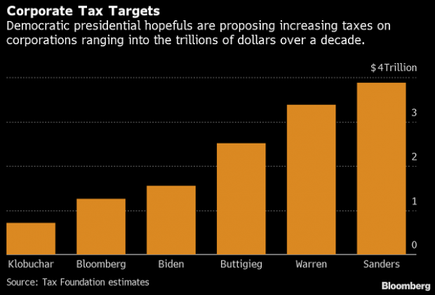
Chart of the Day: Discretionary Spending Droops
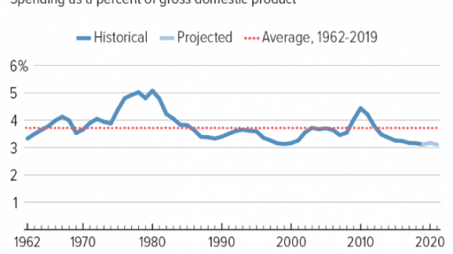
The federal government’s total non-defense discretionary spending – which covers everything from education and national parks to veterans’ medical care and low-income housing assistance – equals 3.2% of GDP in 2020, near historic lows going back to 1962, according to an analysis this week from the Center on Budget and Policy Priorities.
Chart of the Week: Trump Adds $4.7 Trillion in Debt
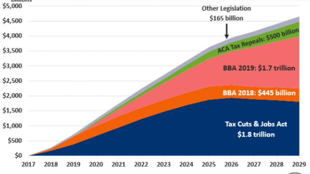
The Committee for a Responsible Federal Budget estimated this week that President Trump has now signed legislation that will add a total of $4.7 trillion to the national debt between 2017 and 2029. Tax cuts and spending increases account for similar portions of the projected increase, though if the individual tax cuts in the 2017 Republican overhaul are extended beyond their current expiration date at the end of 2025, they would add another $1 trillion in debt through 2029.
Chart of the Day: The Long Decline in Interest Rates

Are interest rates destined to move higher, increasing the cost of private and public debt? While many experts believe that higher rates are all but inevitable, historian Paul Schmelzing argues that today’s low-interest environment is consistent with a long-term trend stretching back 600 years.
The chart “shows a clear historical downtrend, with rates falling about 1% every 60 years to near zero today,” says Bloomberg’s Aaron Brown. “Rates do tend to revert to a mean, but that mean seems to be declining.”
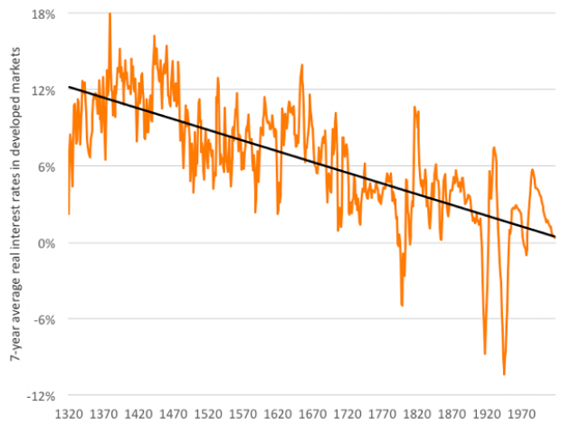
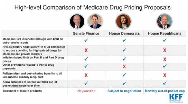
Chart of the Day: Drug Price Plans Compared

Lawmakers are considering three separate bills that are intended to reduce the cost of prescription drugs. Here’s an overview of the proposals, from a series of charts produced by the Kaiser Family Foundation this week. An interesting detail highlighted in another chart: 88% of voters – including 92% of Democrats and 85% of Republicans – want to give the government the power to negotiate prices with drug companies.