The political battle over the effects of the Republican tax cuts is heating up, with Democratic lawmakers on the Joint Economic Committee releasing a set of interactive maps Monday designed to show voters just how well wealthier taxpayers are doing under the tax overhaul.
"As the evidence mounts that the Republican tax law serves large corporations and the wealthy, this initial map will display how the tax bill is affecting American families throughout different states and regions,” said Sen. Martin Heinrich of New Mexico, the top Democrat on the committee.
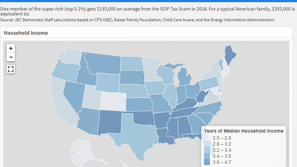
The maps compare the average tax cut the “super-rich (top 0.1%)” are getting in 2018 – $193,000, according to the Urban-Brookings Tax Policy Center – to the income and expenses of a “typical American family” in each state. For example, according to the maps, the tax cut for the wealthiest equals 3.2 years of median household income in Pennsylvania, 49 years of health care premiums in Ohio, 25 years of childcare costs in Texas, and 169 years of electricity bills in California.
You can review the maps here.


